Efficient Design:
BUS APP
A mobile application that allows bus-riders to find and track buses arriving at specific bus stops, and receive real-time updates on their locations and arrival times.
Timeframe
November 2021-
December 2021
Location
Chicago, IL
Design tools
Figma
Adobe Photoshop
Adobe Illustrator

The players
My client for this project was a transportation agency for a middle-sized metropolitan area in the Midwest. I was tasked with designing an app that could be effectively used by the thousands of riders who will use their mobile device to track their specific bus.
The expansion problem
In the past year, the city has made some significant expansions:
Numerous routes have been added.
Some stops now serve multiple bus lines. Riders are complaining the most about the stop at Washington & State, which serves seven.
As a result, riders can’t be sure anymore if the bus arriving at a stop is theirs.
The challenge
The challenges caused by expansion are the same challenges experienced by millions of riders across the country: bus schedules can be unreliable, and finding the information necessary to combat that unreliability can be just as frustrating.
I was given one month to design an app that will:
Enable riders to see which bus is arriving next at Washington & State.
Allow riders to see when each bus will arrive at Washington & State.
Ensure that all riders can tell how much time they have to get to the Washington & State bus stop before the bus they need arrives at that stop.
Allow riders to select one of seven bus lines to see a list of its future arrival times at the Washington & State bus stop.
My role
I led the design of BUS APP between the months of November and December 2021 as the project’s sole member. As a result, I wore many hats, including:
— Researcher
— Project planner
— Product strategist
— Designer
— Prototyper
Discovery and research—
Early questions
I began my journey immediately after the project briefing by considering the gaps in my own knowledge. I began by asking:
How do other transit applications communicate valuable information to riders? Is it effective?
What are the phases a rider currently goes through in their transportation journey?
Competitive Analysis
With these questions in mind, I began laying a foundation for the project with some competitive analysis.
Citymapper
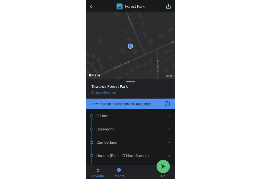
The first app I chose to analyze was Citymapper— a public transit app that displays transport options with live-mapping, among other features. I noticed right away that location tracking was utilized to share relevant information with the user about routes and times, so that the user could gauge how much time they had to catch the bus as well as how far they’d need to travel to that stop. Users can also favorite bus lines and locations for easy access. I also noticed that Citymapper offers alerts that share updates about service changes and delays among other things, which makes for a necessary quality-of-life feature.
Moovit
Similar to Citymapper, Moovit is a transit application that focuses on mobility planning. Moovit offers live updates, including real-time transit alerts, transit updates, and more. The user can also favorite bus lines. Something that stood out to me is that Moovit offers a feature which allows users to see the set bus schedule and real-time arrivals on the same screen.
Competitor usability testing
After I’d analyzed these applications, I chose to run two usability tests on both Citymapper and Moovit to gain insight into how users interact with transit applications, and to understand what they found challenging vs. intuitive.
To accomplish this, I decided to run one test with one user who was already familiar with transit applications, and one who was not.
Results
The results of these usability tests between both users were very similar:
Participants found the persistent ads on the Moovit app to be obstructive and made following through on prompts time-consuming and frustrating.
Users loved that both apps had a layout that was simple, but commented that Citymapper felt more straight-forward and less cluttered with its use of consistent, minimalistic buttons.
Both participants were big fans of the “favorite” features both apps offered, as it meant the process of finding relevant locations could be completed much faster.
I also noted that participants were more likely to interact with features that allowed them to tap on items rather than swipe, which meant that there were some features on the Moovit app relevant to finding important information that went unnoticed, and ultimately made it more time-consuming to complete certain prompts.
User survey
Now that I was equipped with a foundational understanding of transit apps and how users interact with them, I put together a survey that received responses from 27 unique participants between the ages of 15 and 65.
85% of these participants live in a metropolitan area, while the other 15% visit a metropolitan area at least once a year.
20 of 27 respondents use the bus in some capacity, ranging anywhere from a few times a day to a few times a year.
Goals
Bearing my early insights in mind, I outlined some goals for the survey, including:
— To understand how riders feel about the bus-riding experience, whether it be confusing or intuitive.
— To understand what issues riders experience during their bus commute.
— To learn what apps riders use on their bus commute.
— To understand how riders feel about the effectiveness of the apps they use.
— To learn which features riders use the most on transit apps.
— To gain insight into which features riders would like to see in a bus transit app.
Survey results: Key findings
18/20 respondents find the bus-commuting experience to be confusing.
42% of respondents do not use a transit app to help them navigate bus lines.
Of those who do use a transit app, the most often used application is Google Maps, followed by Moovit and Transit.
The majority of users expressed that the transit application they use “gets the job done.” Though a significant portion also expressed that there were some major issues with their preferred app or that they only used it when absolutely necessary.
Respondents’ most-used features in order are bus schedules, bus routes, arrival times, and maps.
Riders want to be able to predict their bus’s arrival with greater accuracy.
18/20 respondents find the bus-commuting experience to be confusing.
User interviews
Once I had a general idea of users’ feelings and experiences with their bus commute and transit apps, I narrowed down my research to two interviews, to learn about the journey a rider takes in their bus commute.
I wanted to understand what the experience is like from the perspective of more than one age group, so I chose to interview:
— 1 user who is in their 60’s.
— 1 user who is in their 30’s.
User #1
Age: 63
Location: Chicago, IL
“My route is consistent, so I know which bus I take and the location where I catch that bus. So it’s really a matter of waiting for the bus, hoping the bus will be on time, and taking it to the next location where I transfer.”
User #2
Age: 31
Location: Minneapolis, MN
“I use the bus to get anywhere I can’t walk– so most places. I’m familiar with the area now so it’s not as much of an issue, but I use Citymapper because it lets me search where I need to go and I can find a bus route that will take me there. But generally, it’s a lot of waiting and hoping I didn’t miss my bus.”
Key findings
— Participants placed emphasis on being able to see bus locations in real-time, and receive updates on ETA.
— Participants prefer simplicity and an app that “isn’t cluttered.”
— Participants expressed that their bus-commute can be confusing, especially when multiple lines are involved.
— User #1 expressed that a lack of simple, straightforward information was intimidating.
User personas
I gained a lot of useful insight in my interviews, which allowed me to develop 2 user personas:
One, a 58 year-old business owner named Don with limited technical ability, who wants information presented to him in a straightforward way that will simplify his commute.
The other, a 27 year-old teacher named Anya who grew up with an understanding of technology that makes it more intuitive to her. Anya’s biggest concern is finding a reliable way to get to work on time in the midst of unpredictable bus times.
Both Don and Anya need effective communication about bus arrivals, locations, and times. While Anya might be more tech-savvy, Don needs an application that is simple and presents information clearly.
User stories
I put together a few user stories for Anya, as I began to ideate on these personas as well as my competitor usability tests. I began to list the steps she might take to find the information she is looking for when commuting by bus, using the priorities I’d found in my survey results as well as the journeys shared with me during my interviews.
Define—
User flows
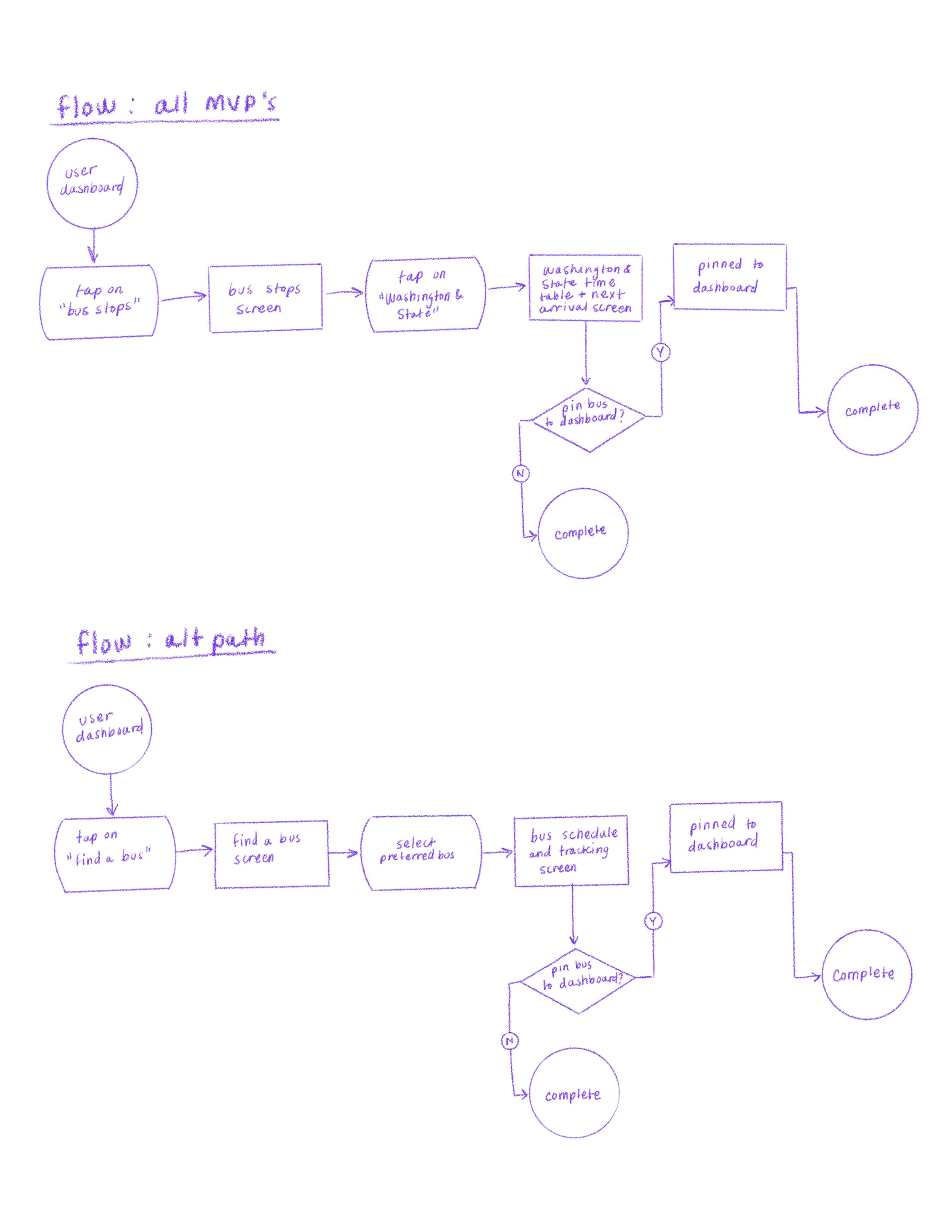
My first user flows were drawn up with the intention of fulfilling every goal within the scope of the project in one flow.
I wanted to make it as simple as possible for the user to find all of the information they were looking for, without cluttering individual screens. I also wanted to give users alternate paths depending on the information they are looking for.
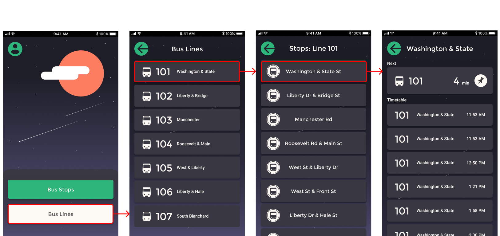
Flow 1: Bus stops
Initially, I considered including an information dropdown on the “Arrival Times” screen, but felt that obscuring information in a drop down that could be easily viewable on the same screen was not accessible, based on my previous competitive tests.
Flow 2: Bus lines
This route will ultimately direct users to the same page as the “Bus Stops” route, featuring a map that tracks their chosen bus’s current location in real-time.
This route also includes timetables correlating to the specific bus line and bus stop chosen by the user.
Site map
Once I’d completed my user flows, I fleshed out the site map. The priority remained to keep things simple and stick to the MVP.
Wireframing
With the organization of these references, I was able to begin the wireframing process. First, I sketched everything out, visualizing each screen and how it interacted with the others.
I carried my user-inspired goals from my user flows into the development of wireframes:
— To make it as simple as possible for users to find the information they are looking for, without cluttering screens.
— To give users alternate paths depending on the information they are looking for.
— To fulfill every goal within the scope of the project in one flow.
With some organized sketches, I began putting the pieces together in Figma to create a digital wireframe.
A lot was added and tweaked in the making of the digital wireframe. The ability to see everything laid out on the screen, and to move, transform, add, and delete objects quickly was a real catalyst toward the development of the wireframe— including some aesthetic changes.
Once the digital wireframes were laid out with the use of a four-column grid with future responsive design decisions in mind, I began working on the low-fidelity prototype.
Develop—
Visual design
I took to the internet in search of inspiration that would impact BUS APP’s look, filling my visual library with everything from UI patterns to illustrations, and even began playing around with palettes and ideas as I organized my mood board. Hearing the perspectives of my interview participants influenced me to find inspiration that evoked a sense of calm– something that was relaxing and simple in contrast to the bustle of city life.
The same was true when I chose which fonts to use in-app. I stuck with 2: one display typeface, and one text typeface. Both are simple, clean, sans-serif fonts that are easy to read.
Next, I began to build a style tile for BUS APP using my wireframes, typographical guide and the inspiration from my mood board. I used the style tile as an opportunity to begin creating assets for the high-fidelity prototype, to make an easier task of creating multiple screens.
Deliver—
Testing the prototype
Once the high-fidelity prototype was ready, I began the process of running usability tests. It was important to me to begin these tests as soon as possible, to save on resources down the line.
I conducted a total of 5 usability tests– 2 in-person and 3 remote– between December 8th and 9th, 2021. As I had done in the previous competitive usability tests, I included 2 participants who were not familiar with bus commute apps, in order to understand whether BUS APP was accessible to both groups.
All tests required users to respond to prompts with in-app actions.
Goals
I outlined a set of goals for my usability tests, off of which I based the prompts given to users:
— To test the success rate of tasks prompted to the user.
— To measure the number of times the user completes each tasks with the minimal number of interactions.
— To measure the number of times the user strays from the optimal path.
— To test the level of perceived intuitiveness of Bus App for users who are familiar with the bus transit experience.
— To test the level of intuitiveness of Bus App for users who are unfamiliar with the bus transit experience.
Key findings
I received some very useful feedback from the usability tests that suggested I had already fulfilled certain project goals, notably:
— Both users who were unfamiliar with bus commute applications commented that the app was “simple to use” and “worked as expected.”
— One user commented that they felt “relieved” that following the prompts felt “easy and intuitive.”
— Users expressed that they liked the “pin” feature and appreciated that they could receive real-time updates no matter which screen they were on.
— One user commented that they enjoyed the color-palette used in the app, as it was “easy on [their] eyes.”
Success rate
5 users participated in the usability test.
Each user was given the same 17 prompts.
— 4/5 users completed all 17 prompts with no detours.
— 4/5 users completed all 17 prompts with the minimal # of taps.
— 2/2 users who were unfamiliar with the bus riding experience claimed that BUS APP felt intuitive, or “worked as expected.”
Overall task success rate: 94%
Responding to feedback
There were some concerns that users shared about the BUS APP prototype that were instrumental in making it the best that it can be.
Problem #1
Users expressed that it would be helpful if the Bus Route screen and “Current Location” pin included updates on the time of the bus’s arrival rather than just its location.
Solution
This was an obvious change to make, as it fit perfectly within the scope of the project and would make a vast improvement to QOL. So I updated the Bus Route page as well as the “Current Location” pin to include updated times for arrival.
Problem #2
One user was unsure whether they should tap the “home” icon when prompted to “return to the dashboard,” because they did not connect a “home” icon with the term “dashboard.”
This user elaborated that, had the term “home” or “home page” been used, they would have made the connection immediately.
Solution
Because the participant’s confusion was related to the term “dashboard” and not the “home” icon, I switched the usage of the term “dashboard” to “home” in reference to that screen in-app.
Problem #3
Multiple users expressed that it felt needlessly complicated that the bus timetable was only available through the “Bus Lines” button on the home page.
Doing so required 4 extra steps for users who had already found their bus using the “Bus Stops” function.
It was relevant information that was inaccessible, so it needed to be changed— but the most wonderful aspect about this feedback is that it brought me back to one initial goal I’d made for myself when I first began drawing out my user flows:
“To fulfill every goal within the scope of the project in one flow.”
Solution
With the addition of a “Timetable” button to the bus route screen, users can now access the timetable for that specific bus regardless of the steps they took to get there. A simple tap of the “back” button will return them to the map.
Closing thoughts
The feedback I received from the usability tests was incredibly helpful, and concluded with some changes to the way flows interact with each other. Before I ran my tests, Bus App had a lot of useful features that weren’t properly organized. But I was able to use the feedback I received from users to ensure that all information can be accessed from each flow, in an order that is intuitive to the user.


